Header
The header sits at the top of an experience, and lets users navigate to different parts of your product. We use two types of headers – a web header for products hosted on the web and a native header for products hosted on iOS and Android.
How to use the header
The header makes the most important parts of your experience easy for users to find.
- Always place it at the top of the page
- Use the ARIA landmark role to help screen reader users find and understand the header and header navigation elements
- The header component supports text resize, but you should still test with large text sizes in the browser
Navigation bars for web
The header component offers navigation bars that you can adapt to suit lots of scenarios. You can use these navigation bars together or independently, depending on your user’s needs.
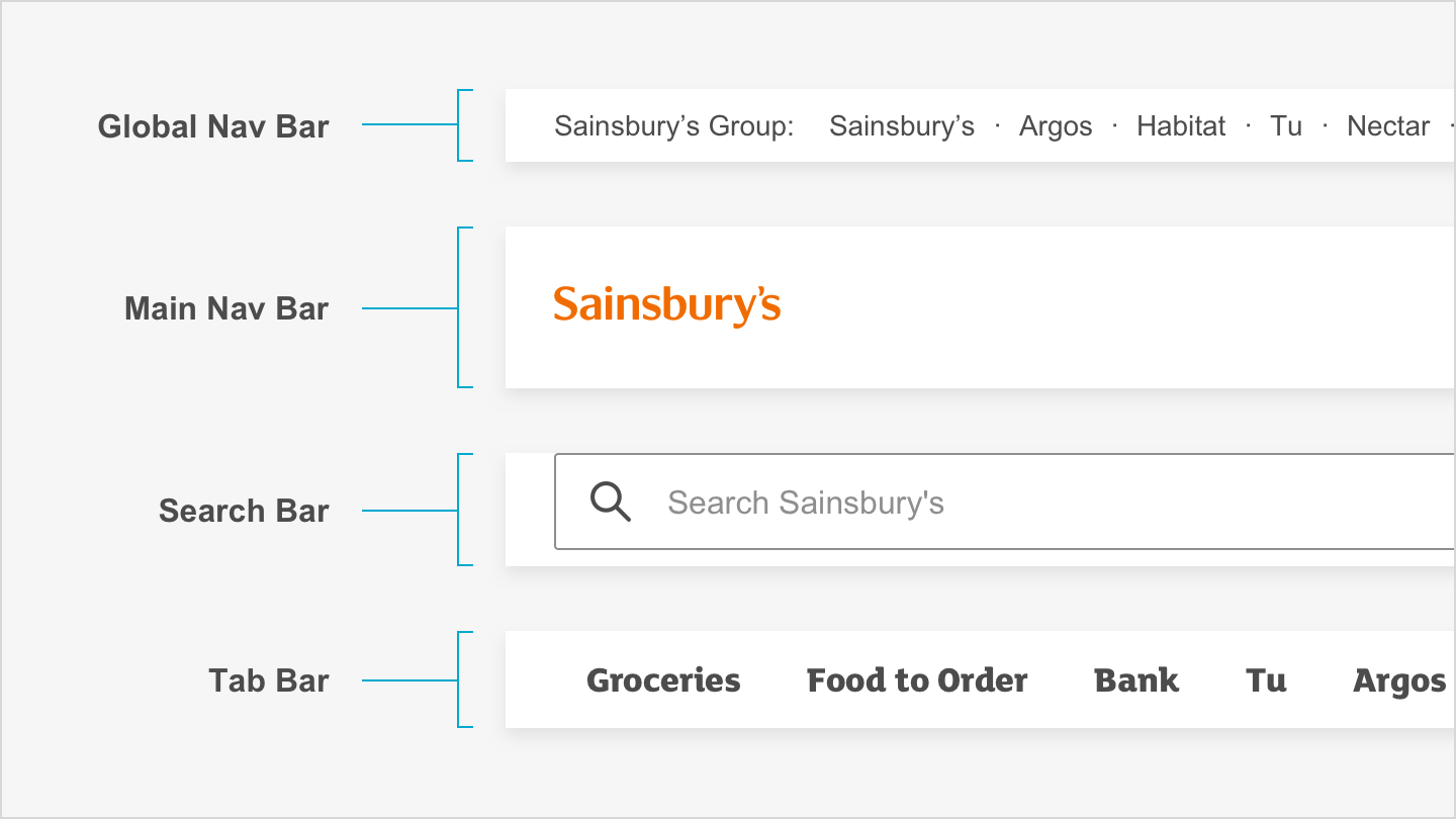
Each bar is optional
Remember that you don’t need to use every navigation bar. Think about the particular use case for each one, and if they suit your user’s requirements.
Global nav bar
The global nav bar enables quick access to other Sainsbury’s brands. The default height size of the global nav bar is 36px.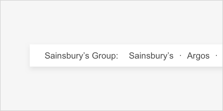
Main nav bar
The main nav bar houses the most relevant Sainsbury’s Group logo for the context, and the top-level navigation items. The default height size of the main nav bar is 80px. When scrolling the sticky header is 64px.
Search bar
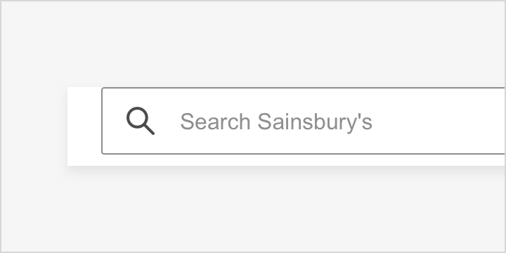
The search bar enables a user to search, so they can find content quickly and easily. The default height size of the search bar is 56px.
Tab bar
The tab bar allows a large number of level 1 navigation items to be displayed on smaller screen sizes. The default height size of the tab bar is 48px.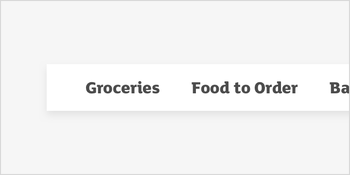
Skip link
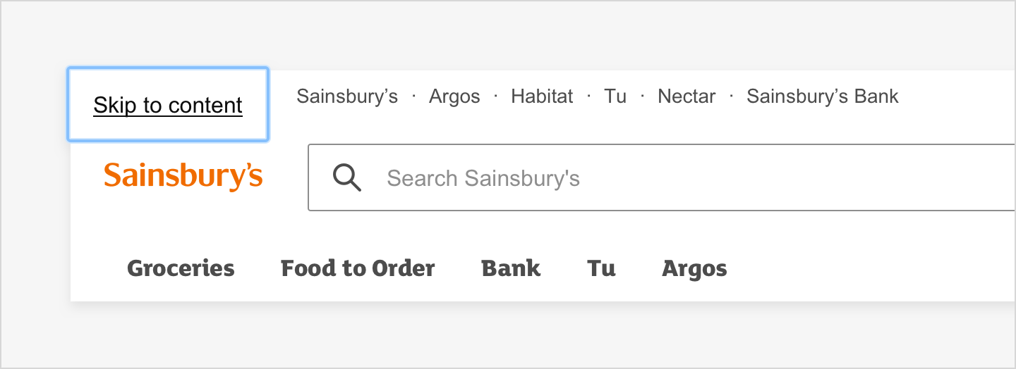
The skip link allows keyboard only and screen reader users to skip over repetitive content like menus. Otherwise, users have to tab through these on every page.The skip link element will only be visible when it receives focus. It should be the first focusable element on the page.
Aligning elements
Elements can be aligned to the centre, left or right within the nav bars.
Centre aligned
When there is only one nav item it should be centre aligned.


Left and right aligned
You can create two groups of related items and align them to the left and right.


Elements for native
There are a number of different elements that make up our native header. You can use these elements together or independently, depending on your user’s needs.
Left icon
Use the left icon to show a back arrow when the screen is part of a journey. Do not include a left icon if the screen is not part of a journey.![]()
Title
Write a title that describes what the user is seeing. Aim to keep titles short and descriptive, 1 or 2 words should do the trick.
Right icon
Use the right icon to show actions that make sense for the screen the user is seeing. For example, the right icon could be used for actions like:
- See more
- Share
- Close (do not use if also using a back arrow as the left icon)
Left action
Use the left action when an icon doesn’t work for what you need to communicate. Choose an action that’s short, clear and intuitive to users.

Right action
Use the right action when an icon doesn’t work for what you need to communicate. Choose an action that’s short, clear and intuitive to users.

Naming elements
Choose a name that describes the icon or action as accurately as possible. Make sure that both design and development know the name of each icon and action.
A screen reader will read the elements from left to right. It will read each element like this:
- Left icon = “(Accessible name) button”
- Title = “(Accessible name) heading”
- Right icon = “(Accessible name) action”
- Left action = “(Accessible name) action”
- Right action = “(Accessible name) button”

Copy guidelines
Labels in the header should start with a capital letter and be in sentence case, unless they are a brand name.
You can use an ampersand (&) in place of the word ‘and’ to reduce characters.