Layout
Luna’s layout guidelines help you to create consistent experiences across different platforms, environments and screen sizes.
Luna's layout principles
Responsive
Our layout principles adapt to different screen sizes, so that users get a great experience regardless of what device they’re using.Flexible
All of our defaults can be modified to meet the needs of different users.Mobile first
In both design and code, we cater for the smallest breakpoint first, then customise as the screen size increases.Grid
The structure of a page is created through the grid. It controls the positioning of components, the spacing between them and how wide they can expand.
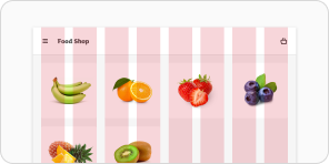
The grid normally makes use of a 12-column layout to cater for either 2, 3 or 4 components being displayed side-by-side.
However, there’s flexibility for other approaches if the design requires it.
Margins, columns and gutters
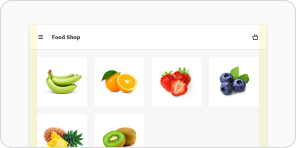
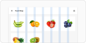
The Luna grid is made up of three different parts. These are margins, columns, and gutters.
Fluid and fixed grids
By default the grid will make use of fluid width columns. It will calculate margins and gutters first, then the columns will adjust to fill any remaining space.
To prevent the grid from scaling, a maximum screen width can be set. At that point the grid will become fixed, with known values for column size.
Implementing the grid in projects
The easiest way to implement gutters and columns in your code is with the grid component.
The container component can be also used to set a maximum width and outer margin for the content within.
Breakpoints
Breakpoints allow for the layout to change on different screen sizes, so that the experience is always optimised for the device the user’s viewing it on.
For example, a product listing page might show 4 columns on a mobile device and 8 columns on a tablet.
Luna has a core set of breakpoints that cover common device groups. You can determine extra breakpoints if needed.
| Breakpoint | SASS name | Minimum width |
|---|---|---|
| default | 0px | |
| extra extra small | xs | 480px |
| extra small | ss | 600px |
| small | sm | 720px |
| medium | md | 960px |
| large | lg | 1200px |
| extra large | xl | 1400px |
| extra extra large | xxl | 1800px |
Spacing
Baseline grid
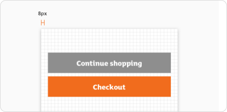
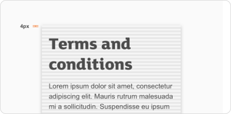
Many components within Luna are aligned to an 8px grid. But for some small components, like iconography and typography, a 4px grid can be used instead.
Click and touch targets
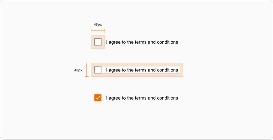
Components within Luna use a standard height of 48px. Larger components go up to 80px.
Clickable or touchable targets should be at least 48px by 48px.
For smaller components like icons, you can use invisible padding to reach the target size.
Padding and scale space
Luna uses the 8px base when adding horizontal and vertical space for layout objects, as well as internal padding within components.
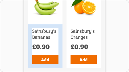
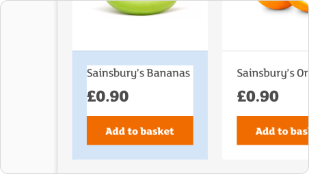
In circumstances where elements would look cramped on larger screen sizes, spacing can adapt based on what breakpoint grouping the device falls in.
These values usually go up in multiples of 8px. But the spacing of elements can increase from 16px to 24px, depending on whether the user is on a phone or computer.
Padding at different breakpoints
| Spacing name | Breakpoints smaller than 720px | Breakpoints 720px or more |
|---|---|---|
| default | 16px | 24px |
| sm | 8px | 16px |
| lg | 24px | 32px |
| xl | 32px | 40px |
Aspect ratios
Aspect ratios describe the relationship between width and height. To keep things looking consistent, use consistent aspect ratios.
We recommend using 16:9, 3:2, 4:3, 1:1, 3:4, and 2:3. These can apply to images, surfaces or components.
Design templates
Design templates can be found within our Figma libraries. They cover popular sizes for responsive web, iOS and Android.
Use them as a starting point when creating a new design or presenting work on a specific device.
Landmarks
Screen reader users may not be able to see the visual structure of a page. Landmarks are used to provide shortcuts that allow screen reader users to jump to key sections.
When a screen reader user navigates to a landmark, they'll be given a relevant description.
How to see landmarks on any page
We recommend you install the free Accessibility Insights Chrome extension. You can then turn on ‘landmarks’ within ‘ad hoc tools’.
How to use landmarks
You should make sure that the key landmarks, such as the header, navigation, main content and footer are present.
They can be added to a page by using a semantic element or by adding a role attribute. These include (Luna component / HTML element / role attribute):
<Header /> / <header /> / role="banner"<Navigation /> / <nav /> / role="navigation"<Main /> / <main /> / role="main"<Footer /> / <footer /> / role="contentinfo"
If there's more than one navigation landmark, use an aria-label to help the user to tell between them (for example, site navigation versus in-page navigation).
Get more guidance on landmarks from MDN Web Docs.